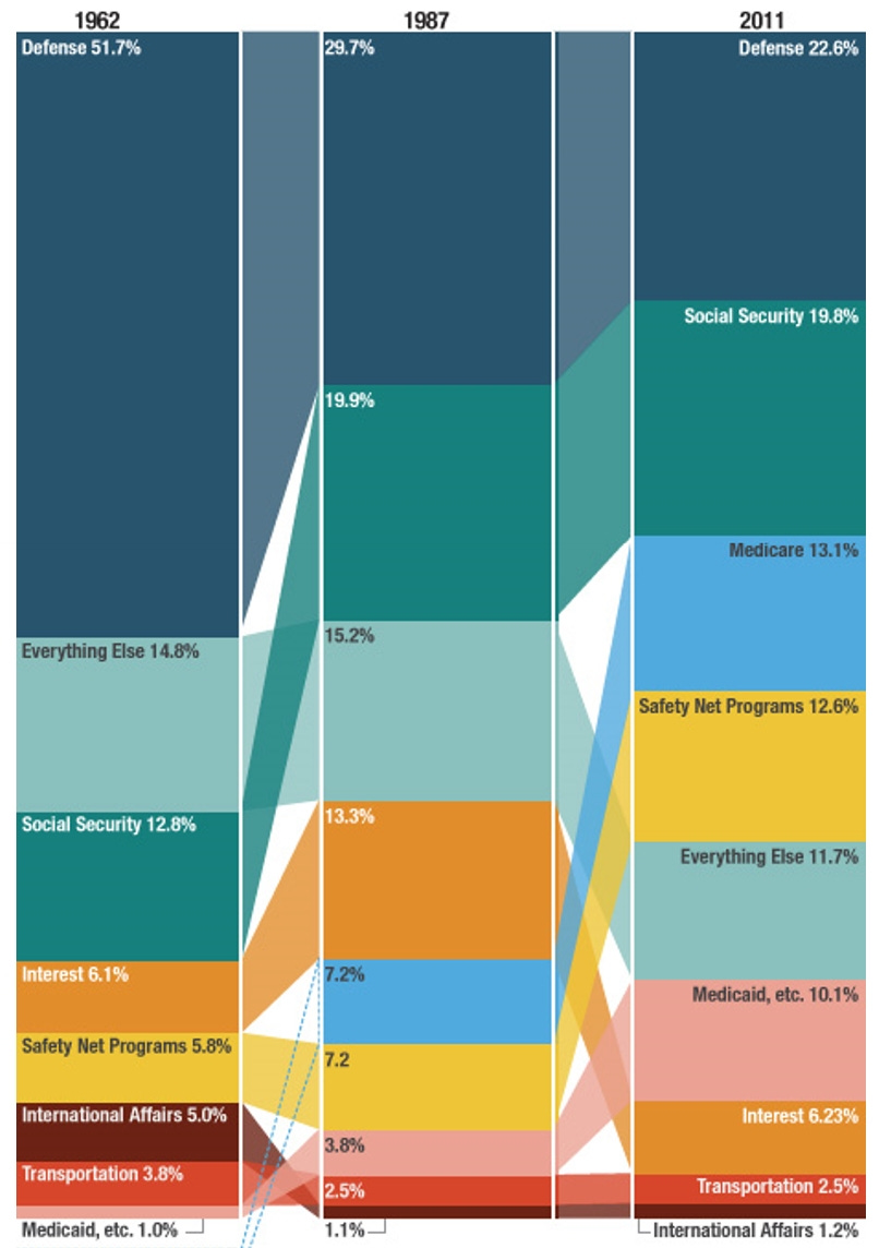
Lots of people think defense spending dominates federal spending, but that hasn’t been the case for a very long time. As this chart shows, the relative size of parts of the federal budget have changed greatly over time, with defense spending decreasing as a share of the federal budget. And the trajectory of federal spending remains today one of ever-increasing shares of the federal budget being devoted to entitlement program spending, not defense.
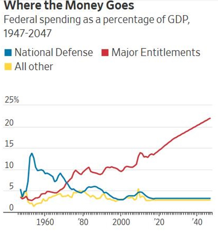
The following chart shows that essentially all of the increase in federal spending relative to Gross Domestic Product (“GDP,” which is essentially a measure of the value of all goods and services produced in a given year) over the past seven decades is attributable to mandatory entitlement spending. As John Cogan wrote back in 2018, “Since the late 1940s, entitlement claims on the nation’s output of goods and services have risen from less than 4% to 14%. Surprising as it may seem, the share of GDP that is spent on national defense and nondefense discretionary programs combined is no higher today than it was seven decades ago.”
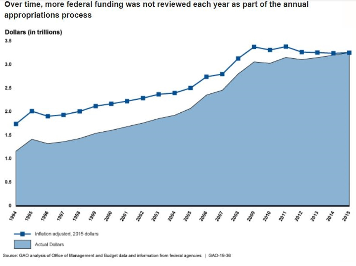
A 2018 report from the Government Accountability Office shows that of the $3.7 trillion the federal government spent in 2015, $3.2 trillion of it did not require authorization by Congress that year because it constituted automatic entitlement spending, and so Congress only specifically approved 14% of what the federal government spent that year.
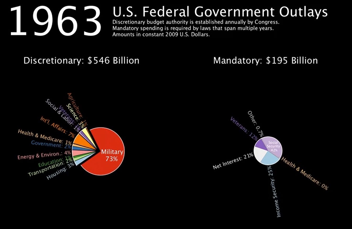
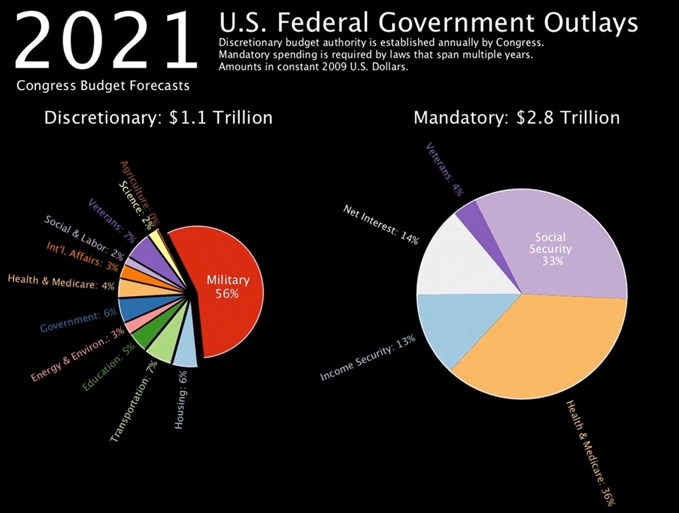
Today, of course, things are much worse. I really like this dynamic video (click on it once it appears) which shows the growth in discretionary spending (the pie chart on the left) verses mandatory spending (the pie chart on the right) over the years. The video shows, over time, the percentage of federal funds devoted to discretionary and mandatory spending, and the proportionate components of each. Below are screen shots of the pie charts as of 1963 and then 2021.
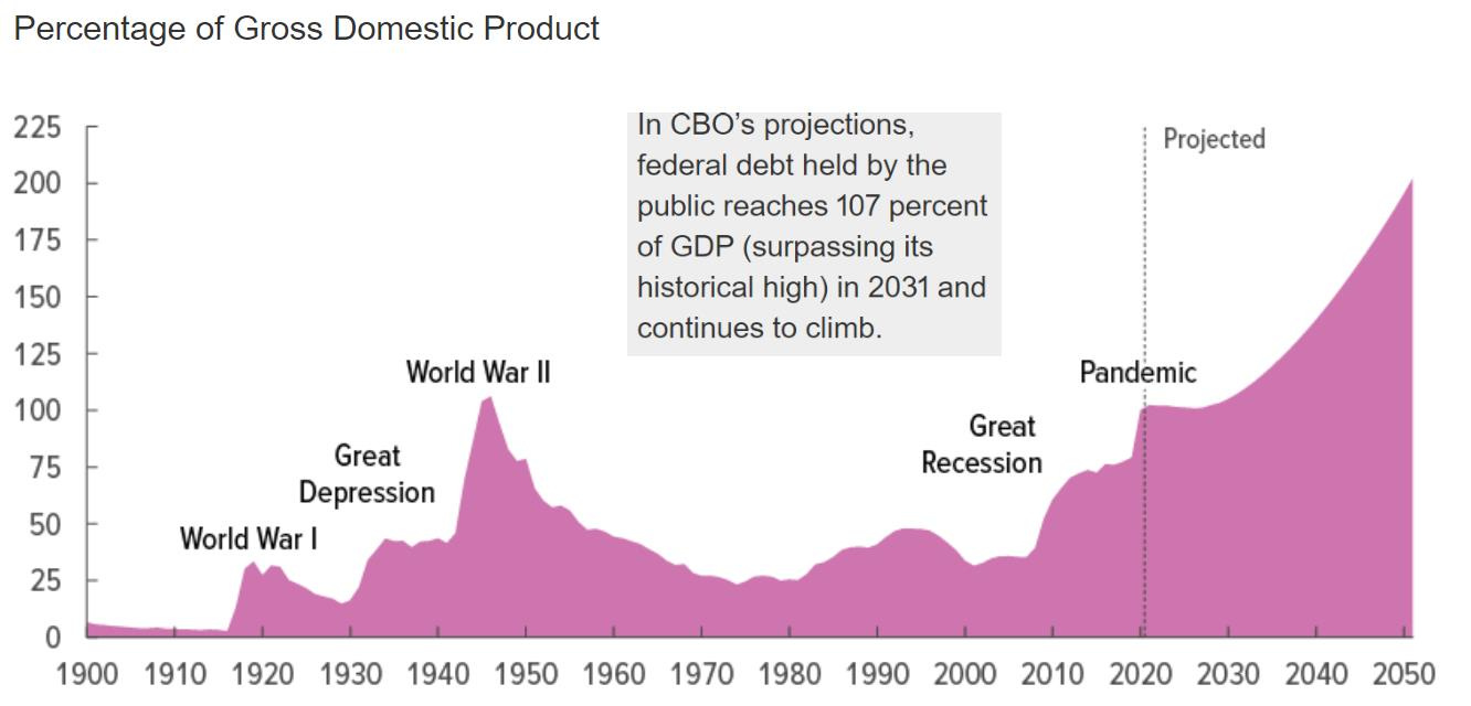
The “official” measure of federal spending and national debt projections comes from a place called the Congressional Budget Office (“CBO”), which was established by Congress to provide some measure of independent analysis regarding budget and spending issues. Here’s the latest version of the CBO’s chart showing projected federal debt as a percentage of GDP.
As Urban Institute researcher C. Eugene Steuerle has described a previous version of this chart:
[It] presents a picture unlike any in our history. From 2001 to 2014, federal debt held by the public rose from 32.5 percent to 76 percent of GDP. Projections generally show it recovering slightly once the economy returns to its potential, and then rising beyond those levels during the 2020s. The point is not simply that debt has peaked at a level higher than any time other than during World War II because of both the recession and the profligate period that preceded it. At no other time in our history has projected future debt done anything but fall rapidly after the emergency of the day -- war or recession -- ended. By contrast, tomorrow’s growing level of debt to GDP results directly from the declining fiscal freedom.
That irresponsible federal spending of the past has only made current spending on COVID-related and other entitlement measures even more burdensome on future generations, as will be explored in a future essay.
The Overly-Optimistic CBO
Again, the “official” projections of national debt are all based on CBO numbers. But it’s worth noting that CBO’s numbers have proven to be overly optimistic in the past in various ways, especially when CBO tries to predict economic growth and deficits further into the future.
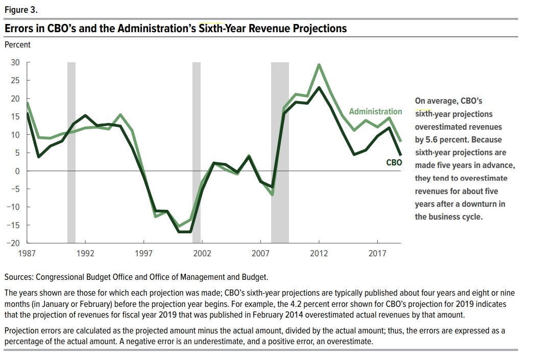
As the Congressional Budget Office has itself admitted, “On average, CBO has slightly overestimated revenues in its budget-year projections; the agency has overestimated revenues in its sixth-year projections by a greater amount … Projection errors are generally larger the further into the future the projection extends. In its projections of revenues for the sixth year of the baseline projection period, CBO has, on average, overestimated revenues by 5.6 percent … In total, 24 of the 33 sixth-year projections overestimated revenues.”
The deficit is the yearly shortfall between incoming federal revenue and federal expenditures. The debt is the sum total of all previous deficits. Regarding national debt projections, CBO reports that “The dispersion of errors has been much larger for debt projections than for deficit projections because errors in annual debt projections compound over multiyear projections. As a result, greater uncertainty surrounds the debt projections … In its debt projections, CBO has … underestimated by 0.6 percent of GDP for the sixth year.”
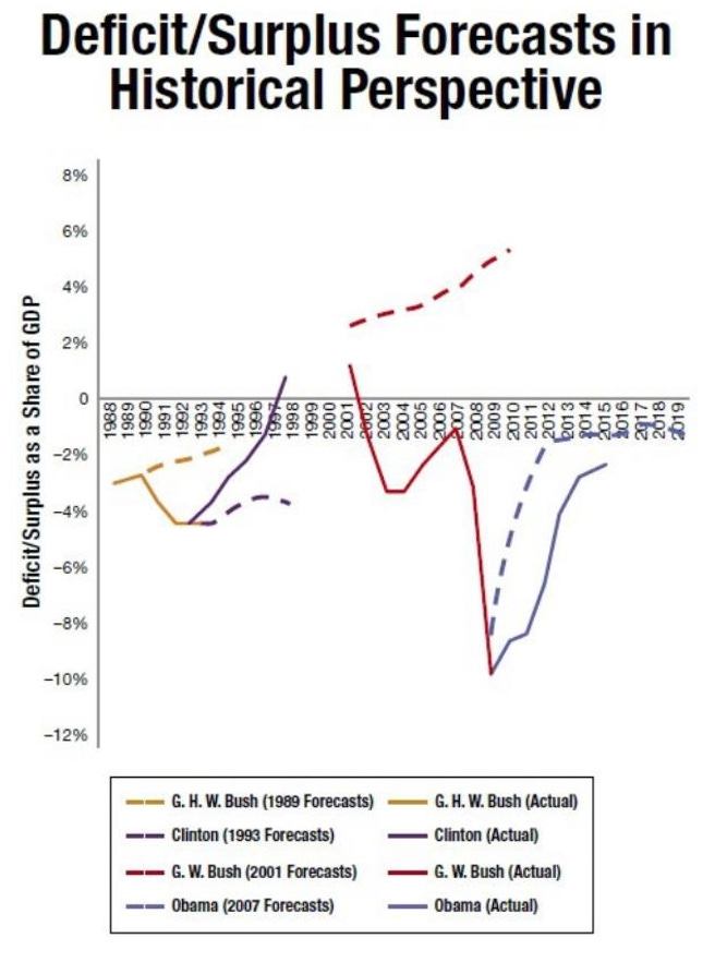
Here’s another chart showing the difference between CBO’s predicted deficit forecasts and the actual deficits that transpired (the actual deficit numbers are in solid lines, the CBO projections are in dotted lines). The author of the chart notes that “ As one can see, the deficit exceeded the CBO forecast for every modern president besides Bill Clinton, who was committed to the deficit-hawk policies prescribed by Robert Rubin and benefited from the dot-com boom.” (Note that this chart was compiled before the presidency of Donald Trump.)
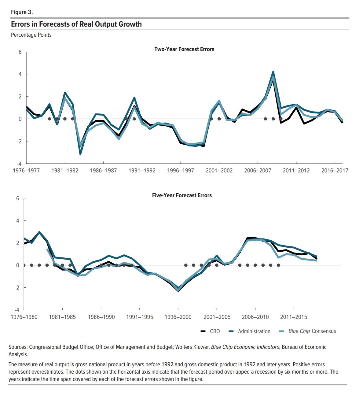
CBO has also tended to overestimate real output growth (a measure of GDP growth) in its forecasts. In the following chart, positive errors indicate overestimates:
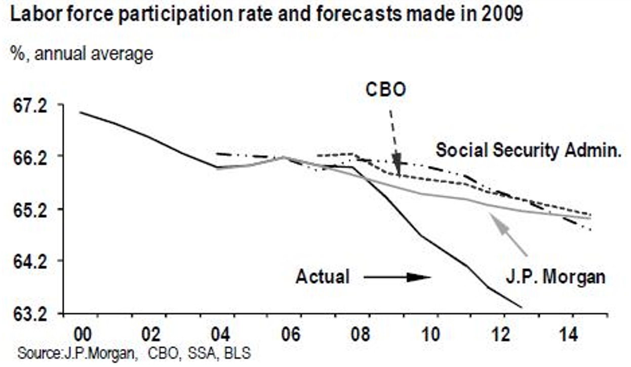
Regarding CBO’s predictions of labor force participation rates (that is, the percentage of the population that is either working or actively looking for work), a previous analysis showed CBO and other entities have also greatly overestimated labor force participation rates, which is a measure of the percentage of people who actively engage in the productive workforce and pay federal taxes. (The dire state of labor force participation rates will be explored in future essays.)
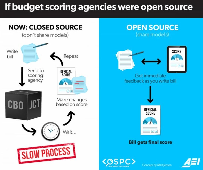
CBO also keeps secret the models it uses for prediction purposes when much of its work should become more transparent.
What all this means is that even the dire projections of CBO today may well turn out to be overly optimistic, and that the situation regarding the national debt will actually end up being much worse than CBO already predicts it to be.
In the next essay, I’ll explore what all these federal debt numbers mean for individual federal taxpayers (like you).
Links to all essays in this series: Part 1; Part 2; Part 3; Part 4; Part 5; Part 6


