The Federal Government on Spending Autopilot – Part 4
Health care entitlements, other potential federal taxpayer liabilities, and a preview of longer-term trends.
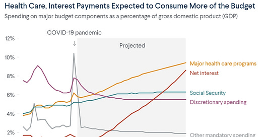
In this essay, let’s look at the big picture regarding how health care entitlements will dominate the federal budget going forward, into the indefinite future. Here’s what that picture looks like now:
As Nate Silver pointed out several years ago in the New York Times (using the following chart): “To clarify: all of the major categories of government spending have been increasing relative to inflation. But essentially all of the increase in spending relative to economic growth, and the potential tax base, has come from entitlement programs, and about half of that has come from health care entitlements specifically.”
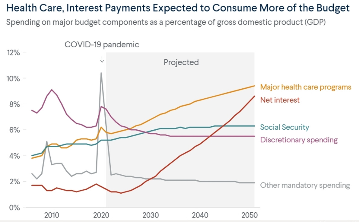
In the past, U.S. public debt as a percentage of gross domestic product generally rose only as a result of having to conduct wars of a finite duration. But when those wars were over, the debt was gradually paid off. More recently, public debt has risen as a result of having to pay for entitlement programs that are of indefinite duration and difficult to reduce over time, especially as the (inaptly named) Affordable Care Act law went into effect in 2014 and beyond. (The specifics of these health care programs and the effectiveness of their operation will be explored in future essays, but for now let’s just focus on their proportionate contribution to the national debt). Here’s another chart showing how much specific health care programs will cost as a percent of the entire gross domestic product:
And the situation will only get worse. As James Capretta at the American Enterprise Institute reports:
Leading Democrats have contended for several years that controlling overall health costs is paramount because working families are overburdened with medical expenses … Now with the power to act, however, party leaders are emphasizing a different agenda. Instead of controlling costs, which is politically difficult, their plan — reflected vividly in President Biden’s most recent version of the Build Back Better initiative — is to shift more of the financial burden onto the government (and thus taxpayers). The net result will be an escalation of aggregate cost growth rather than a slowing down … Organization for Economic Cooperation and Development (OECD) data shows the U.S. spent the equivalent of 16.8 percent of its GDP on health (defined broadly) in 2019. The next highest-cost countries — Germany and Switzerland — were well back, devoting 11.7 and 11.3 percent of GDP, respectively, of their national incomes to health. The average spending among OECD members in 2019 was 8.8 percent of GDP … [I]t is well-documented that not all of the U.S.’s additional spending on medical care is beneficial. Much of it goes toward unnecessarily complex administrative processes and red tape. Further, many interventions add little or no value to the health status of patients, and pricing across the board is inflated by insufficient competition and misguided regulation. Credible studies estimate about 25 percent of total expenditures is waste that could be cut without harming patients.
(Future posts will explore waste in the medical care system in more detail.)
Federal Welfare Spending
Also, as Phil Graham and Jodey Arrington point out in the Wall Street Journal:
True, Social Security and Medicare are a drain on general revenue and will become big fiscal problems if not reformed. But they aren’t the major source of our current fiscal crisis, because both are financed in large part by dedicated payroll taxes … Means-tested social-welfare spending totaled $1.6 trillion in 2023. Welfare spending now absorbs an astonishing 72.6% of unobligated general revenue (total revenue net of Social Security and Medicare payroll taxes and premiums and mandatory interest on the public debt) and is larger than the claims against unobligated general revenue by Social Security (4.1%), Medicare (23.5%) and defense (37.2%) combined. Since funding for the War on Poverty ramped up in 1967, welfare payments received by the average work-age household in the bottom quintile of income recipients has risen from $7,352 in inflation-adjusted 2022 dollars to $64,700 in 2022, the last year with available household income data. This 780% increase was 9.2 times the rise in income earned by the average American household … As a result, the U.S. today redistributes a larger share of its gross domestic product, 29.4%, through transfers and taxes than any developed country in the world except France with 30.1%. After counting all transfer payments as income to the recipients and taxes as income lost by taxpayers, and adjusting for household size, the average households in the bottom, second and middle quintiles all have roughly the same incomes—despite dramatic differences in work effort. With the explosion of means-tested transfer payments, the portion of prime work-age persons in the bottom quintile who actually work has fallen to 36% from 68%. In the second quintile, households with a work-age adult who actually works have declined to 85% from 90%. While work effort fell in the bottom two quintiles, the percentage of middle-income households with a prime work-age person who works has risen to 92% from 86%.
Federal transfers have grown dramatically over time as a share of individual people’s income:
Additional Potential Taxpayer Liabilities
Now, even beyond the national debt held by the public as measured by programs itemized in columns in federal budget spreadsheets, there’s another looming threat to federal taxpayers that isn’t reflected at all on federal balance sheets. There are many government-sponsored enterprises, such as mortgage-facilitators Fannie Mae, Freddie Mac, and the Federal Housing Administration (which have their housing loan promises backed by the full faith and credit of the United States) that expose taxpayers to additional costs that aren’t officially accounted for as federal government debt. Those additional costs would manifest themselves if and when the people who borrowed that money for mortgages (and other things like student loans) couldn’t pay the money back themselves. As this chart shows, when the costs of such programs that rely on taxpayer backing are added to the official federal government debt, the effective debt rises dramatically.
A survey of all federal liabilities that are not recorded in the official federal balance sheet concluded they amounted to 70 trillion dollars back in 2012, six times the size of the reported on-balance-sheet debt.
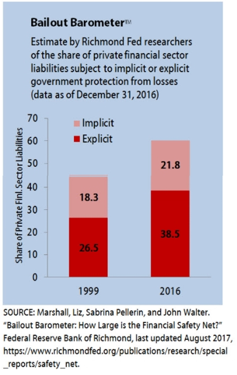
The Federal Reserve Bank of Richmond has performed its own calculations and concluded that by the end of 2016 federal taxpayers were standing behind $42 trillion in financial liabilities.
The Bailout Barometer is an estimate by Richmond Federal Reserve researchers of the share of private financial system liabilities for which the federal government provides protection from losses. As the Richmond Fed explains:
Richmond Fed researchers estimate that 60 percent of the liabilities of the financial system are subject to explicit or implicit protection from loss by the federal government. This protection may encourage risk-taking, making financial crises and bailouts more likely … The latest estimate shows that the financial safety net covers 60 percent of the financial sector. This estimate also includes a breakdown by sector. These measures, compiled in August 2017, use data as of December 31, 2016. The Bailout Barometer has grown considerably since it was first estimated in 1999 … [This matters because] [w]hen creditors expect to be protected from losses, they will overfund risky activities, making financial crises and bailouts like those that occurred in 2007-08 more likely. An extensive safety net also creates a need for robust supervision of firms benefiting from perceived protection. Over time, shrinking the financial safety net is essential to restore market discipline and achieve financial stability. Doing so requires credible limits on ad hoc bailouts.
The Perfect Storm of Debt Trends
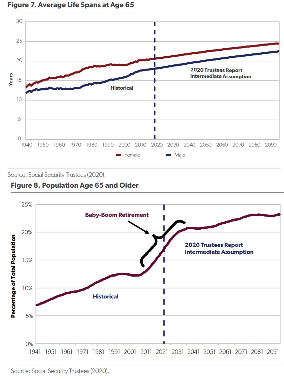
Now, let’s look at various trends that don’t bode well for a future America’s ability to pay off the debt whenever it needs to. As of June, 2020, the American Enterprise Institute compiled the latest figures on federal budget deficits per year, and included information on the U.S. fertility rate, the average U.S. lifespan after age 65, the percentage of the U.S. population age 65 and older, and the U.S. workers-to-retirees ratio. Let’s look at how all these trends reduce the ability of a future America to pay off its national debt when necessary.
Today, the fertility rate is lower than ever (a phenomenon that will be explored in more detail in future essays). That means that, going forward, there will be increasingly fewer younger people who will be working and paying the federal taxes necessary to fund the ever-expanding entitlement programs for both the elderly and the increasing number of younger people who are taking advantage of these entitlement programs as well.
At the same time, people are living longer, so they are collecting entitlements longer, all while the percent of the population that is older is growing:
And that dynamic reduces the worker to retiree ratio:
And with fewer tax-paying workers per entitlement-collecting senior (and, increasingly, entitlement-collecting junior), each worker will have to pay even more taxes than ever to fund the entitlement system. All this, while even more younger workers are dropping out of the labor force, as will be explored in future essays.
Links to all essays in this series: Part 1; Part 2; Part 3; Part 4; Part 5; Part 6


