Reading Data Graphics is a Moral and Intellectual Act – Part 2
Corruption in the presentation of evidence.
This essay continues our discussion of Edward Tuft’s Beautiful Evidence and his advice regarding how best to design and analyze charts, graphs, and other visual displays of quantitative information.
In a chapter entitled “Corruption in Evidence Presentations,” Tufte writes:
Making a presentation is a moral act as well as an intellectual activity. The use of corrupt manipulations and blatant rhetorical ploys in a report or presentation – … flagwaving … setting up phony alternatives, misdirection, jargon-mongering, evading key issues … -- suggests that the presenter lacks both credibility and evidence. To maintain standards of quality, relevance, and integrity for evidence, consumers of information should insist that presenters be held intellectually and ethically responsible for what they show and tell … [W]idely used presentation methods … often distort evidence, deceive the audience, and exploit the bond of trust necessary for reliable and intelligent communication.
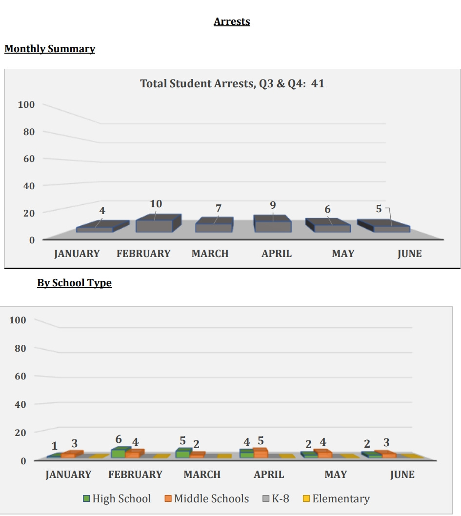
I see that often in the reports and presentations given to our local school board. For example, the school bureaucracy has a habit of appearing to try to disguise bad outcomes by placing the data in bar charts that have inappropriately large scales in order to show lots of empty space and project a “Nothing to see here!” vibe. A rise in violent incidents at our local schools last year made area news reports, but here’s how the arrest statistics were presented in the report to the school board:
Maybe next time they’ll make the scale go up to 1,000 so the arrests will shrink to near-invisible tiny lines at the bottom of the chart!
Tufte also describes how reducing presentations to cheerleading bullet points tends to eliminate crucial information, like who specifically is going to be held responsible for achieving or not achieving a specific goal:
[B]ullet-list format collaborates with evasive presenters to promote effects without causes, as in the fragmented generic points of cheerleading strategic plans … Better to say who will [perform], and what, how when, and where they will [perform]. An effective methodology for making such statements is the sentence, with subjects and predicates, nouns and verbs, agents and their effects.
In a previous essay, I described how our local school board’s much-touted “5-year plan” amounts to a jumble of vague aspirations that fails to identify specific metrics by which specific officials will be judges on their performance:
[The plan] define[s] “Educational Excellence” as follows: “We keep the bar high in all we do. We educate students for life and for reflective citizenship. We empower students and employees in the preservation of their identity and culture. Substance, depth, and critical thinking are more important than compliance or test scores.”
… So much for holding adult education officials responsible for the need for objectively-measured improvements in student learning. There’s no statement in the Equity for All Strategic Plan of the need to demonstrate educational excellent by improving objective, standardized test scores to reduce the achievement gap, even though standardized test scores are used to define the achievement gap itself in the same document. Indeed, “test scores” are explicitly subordinated to other, higher-priority (and subjective) metrics, namely “empower[ing] students and employees in the preservation of their identity and culture,” with the statement concluding with “Substance, depth, and critical thinking are more important than compliance or test scores.” In this way, the document defaults to subjective metrics adults can tweak to achieve political ends, rather than objective measures that would demonstrate child-centered learning to the benefit of children.
Tufte continues:
The most widespread and serious obstacle to learning the truth from an evidence-based report is cherry-picking, as presenters pick and choose, select and reveal only the evidence that advances their point of view ... [T]houghtful presenters might at least privately test their analysis: Has evidence been filtered or culled in a biased manner? Do the finding grow from evidence or from evidence selection? Would the findings survive the scrutiny of a skeptic ...? Of course, there is more evidence than that published. The key issue is whether evidence selection has compromised the true account – if we only knew what it was – of the underlying data.
To give another local example of this, our Parent Teacher Association (PTA) sent out this “talking point” that parents were asked to use to convince the local city council to increase taxes to provide the local school system even more money (when the spending per student in the school system under the current budget is already over $20,000 per student):
There is a strong correlation between adequate funding and student success. FUNDING IMPACTS EDUCATION SUCCESS! Research shows a $1,000 increase in per student spending was associated with 2.3% higher graduation rates.
The problem with that statement is that, while high school graduation rates (which are easily manipulable by altering graduation requirements and grade inflation) have been going up as local school budgets and bureaucracies get increasingly bloated over time, objectively measured learning achievement in the form of the Scholastic Aptitude Test (SAT) has been going down, even as spending has gone up.
As Mark Schneider writes, as a general matter:
Except for tiny Luxembourg, the United States spends more money on education than every other OECD country and exceeds the OECD average by over 50 percent. This is not just true of absolute levels of expenditures: As a share of GDP, combining federal, state and local expenditures, the US also spends more on education than its peers. In 2021, the US spent about 5.6 percent of GDP on education, compared to the OECD average of 5 percent, 4.5 percent in Germany, 3.5 percent in Japan, and 5.2 percent in France. Over the past two decades, this continual increase in spending outpaced the growth in the student population, such that per-pupil expenditures on education grew from $16,600 in 2003 to close to $20,000 in 2022 (in constant 2022 dollars). But even as more money gets poured into our education system, student performance has not improved. Student scores on the National Assessment of Educational Progress (NAEP) peaked years ago and have declined over the last decade. Our students have also not improved on the Programme for International Student Assessment (PISA), which tests 15-year-old students across the globe. In 2000, the first year of PISA, US students scored 504 in reading and 482 in math (PISA was designed to make the average score 500 points, with a 100-point standard deviation). In 2022, the most recent PISA test administration, the US scored 504 in reading—the same as 2000. And math? Just 465.
In another example, one program that is a priority for our local school board is called “Social, Emotional, and Academic Learning.” The local high school newspaper reported on it in October, 2023, as follows:
If you attend Alexandria City High School—or any ACPS school for that matter—you most likely are familiar with SEAL lessons, which are presented during the advisory period for all students to observe. Short for Social, Emotional, and Academic Learning, these lessons aim to educate students about social and life skills in a fun, engaging manner … SEAL lessons are widely unpopular among the students of ACHS. This dislike, however, is not just present among students but also among the teachers, with reports of teachers either skimming through the lessons or skipping them entirely. The only people who seem to believe, with good faith, that SEAL lessons are practical is the administration of the high school—but who even knows if they believe in them? Despite SEAL’s unpopularity, the administration still requires the lessons to be shown throughout the school during the advisory period on blue days ... Theogony created and distributed an online survey about SEAL’s content, relevance, and effectiveness to students. When asked their thoughts on SEAL lessons, one student answered, “They are not in touch with students and are often repetitive.” This often seems to be the case: it’s the perpetual problem of a point being repeated so much that it’s become exhausted and become completely devoid of meaning. Other students described them as “useless,” “ineffective time wasters” and even “stupid.” One even went so far as to say that those who support the SEAL initiative “bootlick the school board and a collective of out-of-touch parents.” ... In Theogony’s survey, the data about SEAL Lessons was not encouraging. When asked how often they pay attention to the lessons, 50% of respondents said they never do so, with an additional 25% saying they ignore the lessons more often than not. These two groups make up an overwhelming majority of 75% of respondents who, frankly, seem not to care much about SEAL ... The survey ... asked how effective SEAL lessons are, and a resounding majority of people— around 75%– said they were not effective at all. Moreover, only 5.2% of students said that they were very effective. And, when questioned about how often their teachers went through and taught the lessons, 25% of respondents said that their teacher never or almost never showcased the SEAL lessons. It’s safe to say that things are looking grim for SEAL lessons. Unfortunate as the current situation is, perhaps these results will act as a wake-up call for the School Board and the rest of ACPS. However, for now, it seems that the administration at ACHS remains staunch and set on continuing to distribute SEAL lessons to the masses at all costs.
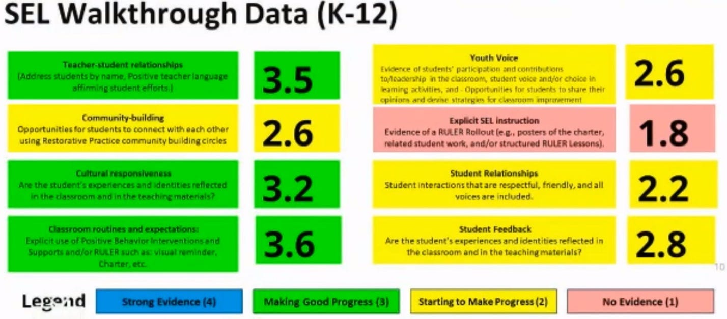
Yet when our local school board was given this PowerPoint presentation in April, 2024, regarding the state of the same program, the presenter of the SEAL PowerPoint stated “People ask me all the time – like, seriously ask me all the time – why do we do this? So I’ve been trying to find the right way to say, that I think I got it. Because promoting social and emotional learning in classrooms and throughout the school normalizes thoughts and feelings for all students so that they engage more in their learning.” Putting aside that the speaker offered no evidence that students engaged in more learning (indeed, the SEAL program takes precious time away from reading and other instruction), the speaker made no mention at all of the district’s only high school’s poll on the subject, the results of which were directly contrary to what the presenter said was the goal of the program. Neither did the other presenters, who listed various measurements of how much or how little teachers were implementing the program, but no evidence at all of the effectiveness of the program for students.
Remarkably, one of the presenters told the school board “As we grow it is our ultimate goal to integrate social and emotional learning into the academic curriculum to truly be a SEAL school division. The explicit teaching of social and emotional learning today supports the achievement of the integration goal tomorrow.” All without acknowledging the abject failures of the program, as reported by students and teachers.
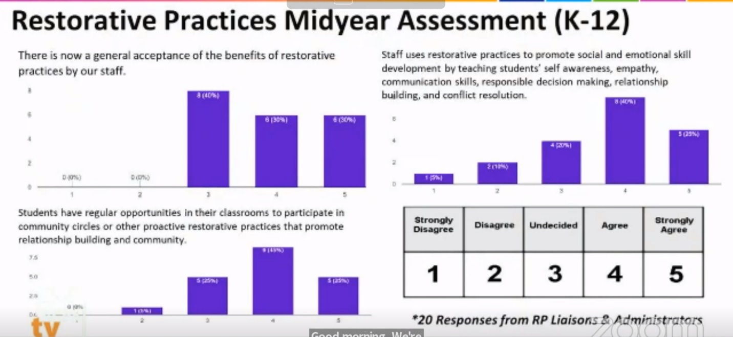
The presentation went on to describe how another school board-supported program, called “restorative practices” is apparently now “accepted as beneficial by staff.” But the survey of acceptance was among only “20 RP [Restorative Practices] Liaisons & Administrators,” namely the people whose jobs rely in whole or in part on a perception that the program is successful in some way.
The same dynamic in which choosing biased evaluators leads to untrustworthy results occurs in medicine. As Tufte writes:
Thomas Chalmers, a founder of evidence-based medicine, repeatedly demonstrated that the more susceptible a research design is to evidence selection and bias, the more enthusiastic the evidence becomes for favored treatments.
As Tufte points out, poorly substantiated organizational presentations can indicate much deeper problems within the organization:
By generating corrupt repackagings, an organization’s bureaucracy … may come to corrupt the integrity of work within the organization. Compromised external communications promote compromised internal communications, as pitching out corrupts within.
As Tufte explains, the point of visual data presentations is to explain the truth of some claim, not to fit cherry-picked information from potentially biased sources into graphs pre-determined to support a certain position:
[T]he principle of information integration points to a philosophy of inquiry: a broad, pluralistic, problem-directed view of what constitutes the scope of relevant evidence. Too often in scholarly research, in social science at least, there is a certain narrowness in the choice and use of evidence. Thus many investigations of, say, political economy rely exclusively on a single mode of evidence: statistical data, or wordy memoirs of policy-makers, or anecdotes, or mathematical models, or metaphor, or economic or political ideology … Research questions are framed along the lines of “How can one type of information or one particular approach be used to explain something?” rather than “How can something be explained?” … A deeper understanding of human behavior may well result from integrating a diversity of evidence, whatever it takes to explain something. Like good information displays, explanatory investigations, if they are to be honest and genuine, must seek out and present all relevant evidence regardless of mode.
In our local school system’s “School Year 2023-2024 Data Digest,” no attempt is made to actually digest the data in ways that help explain educational outcomes. For example, the document touts that 83% of PreK-12 students have “over 90% attendance.” Well, what of the remaining 17%? Do they not attend school at all, such that the takeaway could just as well have been “17% of PreK-12 students don’t attend school [or don’t attend on a regular basis].” The document does not say.
The report later breaks down attendance by race, showing that some groups have significantly worse attendance records than others.
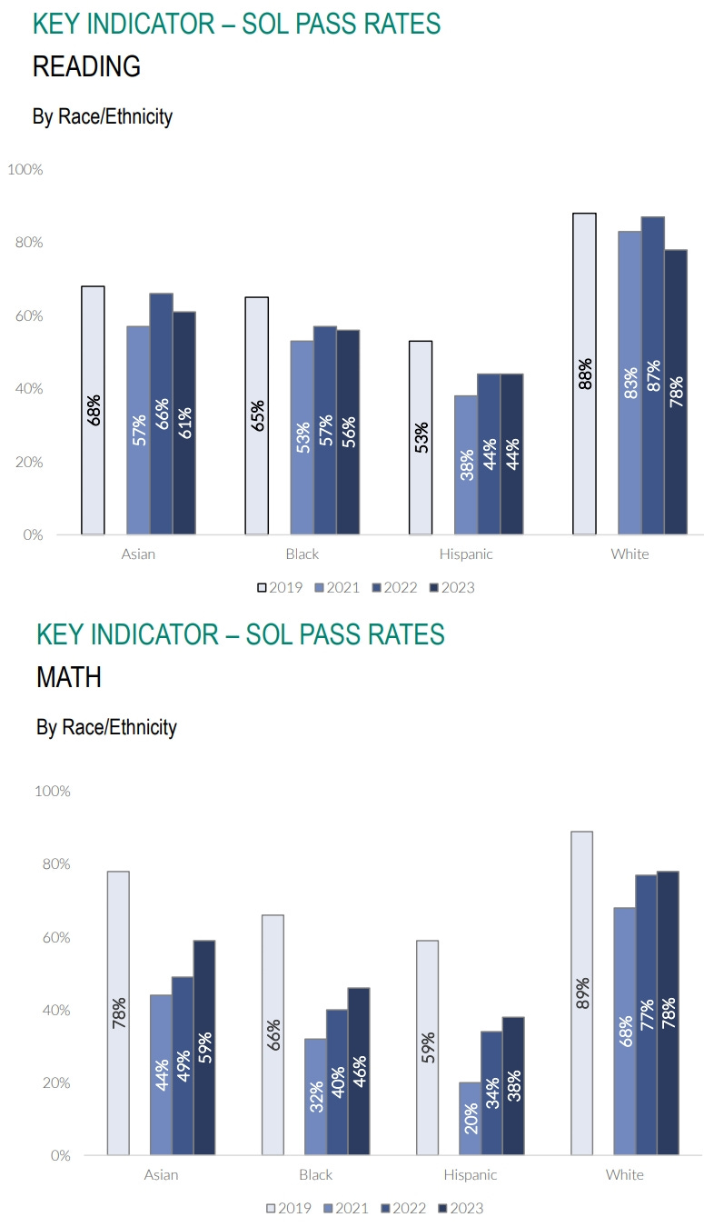
The report later shows pass rates for a Standards of Learning (SOL) standardized tests, showing worse results in reading, but some progress in math.
But to what extent is any test score progress influenced by the fact (presented previously in the report) that many fewer students are showing up for school (and presumably not taking the tests as a result)? If the students not attending school tend to be worse performers on standardized tests, then their absence will tend to inflate overall test scores. Yet there is no attempt to address such a possibility in the report, even though it could result in a situation in which overall test scores would have actually been even lower in 2024 had there simply been better attendance.
Tufte also makes the point that relaying data regarding long-term trends would greatly benefit from what he calls “sparklines” which show not just a recent data point or two, but a quick visual of how those data points relate to longer-term trends and the “normal limits” of the data being used. As Tufte writes, giving the example of glucose levels in the human body used by doctors:
Placed in the relevant context, a single number gains meaning. Thus the most recent measurement of glucose should be compared with earlier measurements for the patient … Some useful context is [also] provided by showing the normal range of glucose, here as a gray band. Compared to normal limits, readings above the band horizon are elevated, those below reduced.
And so instead of simply relaying a couple data points, local school bureaucracies should relay student test score data in larger context, showing longer-term trendlines that include many years for comparison, and perhaps a gray band that indicates the “normal” range of scores among students nationwide, statewide, or within some other larger context.
Further, it’s puzzling why school bureaucracy presentations to our local school board don’t reference data already organized by independent organizations such as Georgetown University’s NERD$ site, which posts fiscal year 2023 school-by-school financial files for some states in as few as six to eight months after the close of the fiscal year. School districts could easily combine that financial data with Stanford’s SEDA performance data and use it to inform their decisions for the next budget season. Stanford University’s SEDA performance data compilation includes this this type of information on our local school district:
In the next and last essay in this series, we’ll explore what Tufte has to say about PowerPoint presentations, and their negative effects on clear thinking.


Paul, I cannot imagine why you stay in that school district. It sounds awful. Cretins doing bad things for bad reasons. The illustrations are compelling since they are from not only real life but YOUR real life...but the conclusions (irrespective of the education vis-a-vis graphics) are immiserating.