Reading Data Graphics is a Moral and Intellectual Act – Part 1
The wisdom of Edward Tufte.
When I was in college at Yale, I took a wonderful class called something like “The Visual Display of Quantitative Information,” taught by Professor Edward Tufte, who specializes in teaching people how to best relay data in an easy-to-read manner that also sufficiently captures relevant context. At a recent library book sale, I came across one of Professor Tufte’s many books, this one entitled Beautiful Evidence, and it rekindled my appreciation for his work. Once you read Tufte, you’ll forever appreciate how many of the charts and graphs presented by government and the media fail their consumers by presenting information in non-credible ways that often result in obscuring instead of illuminating relevant information.
As Tufte writes in the Introduction to Beautiful Evidence, “The book identifies excellent and effective methods for showing evidence, suggests new designs, and provides analytical tools for assessing the credibility of evidence presentations.” His book is “based on the premise that the point of evidence displays is to assist the thinking of producer and consumer alike … [T]he practices of evidence display are derived from the universal principles of analytic thinking – and not from local customs, intellectual fashions, consumer convenience, marketing, or what the technologies of display happen to make available. The metaphor for evidence presentation is analytical thinking.”
Tufte’s philosophy of evidence displays is based on the premise that “evidence presentation is a moral act as well as an intellectual activity. To maintain standards of quality, relevance, and integrity for evidence, consumers of presentations should insist that presenters be held intellectually and ethically responsible for what they show and tell. Thus consuming a presentation is also an intellectual and moral activity.”
Tufte starts by describing how Galileo first revolutionized the visual display of data, and in doing so he revolutionized our understanding of our place in the universe:
In late 1609, Galileo constructed a telescope and soon made more discoveries that changed the world than anyone has ever made before or since. The Starry Messenger [Siderius Nuncius], published in March 1610, announced the discovery of craters on the moon, a multitude of stars beyond those few seen by unaided eyes, and the 4 satellites of Jupiter. More importantly, the book “told the learned community that a new age had begun and that the universe and the way in which it was studied would never be the same.” From then on, theories about the universe had to be tested against the visual evidence of empirical observation. This is the forever idea in Galileo’s book. And so armchair speculation, parsing Aristotle and religious doctrine, and philosophizing were no longer good enough. Evidence became decisive in understanding Nature … [F]rom then on, all science, to be credible, had to be based on publicly displayed evidence of seeing and reasoning, and not merely on wordy arguments.” [Citations omitted.]
Galileo himself wrote:
What was observed by us … is the nature or matter of the Milky Way itself, which, with the aid of the spyglass, may be observed so well that all the disputes that for so many generations have vexed philosophers are destroyed by visible certainty, and we are liberated from wordy arguments.
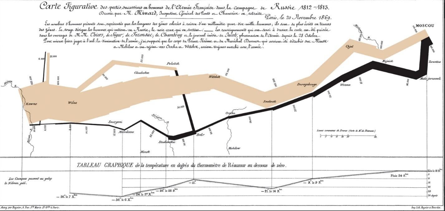
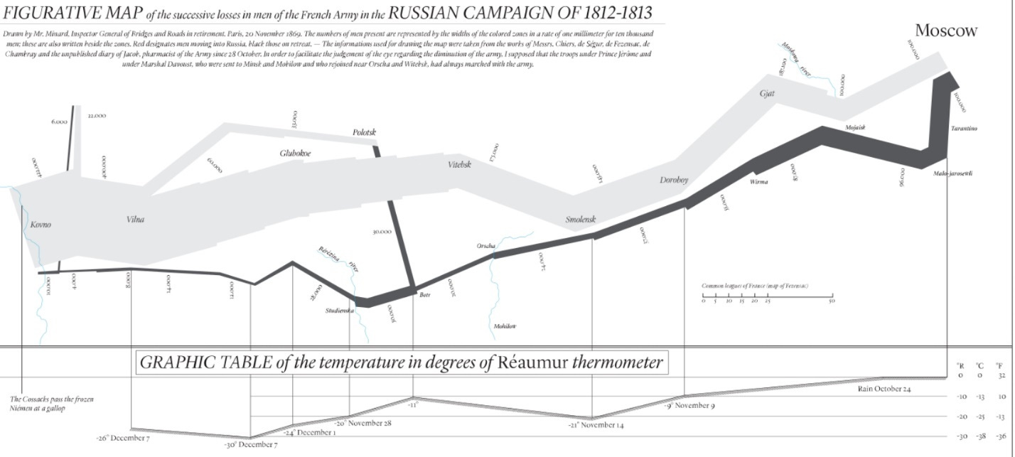
Tufte then describes one of his favorite pieces of historical data displays, namely the chart by Charles Joseph Minard showing the loss of life among Napoleon’s army as it marched in and out of Russia between 1812 and 1813:
Beginning at the left, on the Polish-Russian border near the Neiman River, the thick tan line shows the size of the Grand Army (422,000 men, drawn from all Europe) as it invaded Russia in June 1812, as well as the army’s path. As the soldiers die, the line narrows; the flow-line indicates the number of remaining soldiers at each position on the map. Also shown are movements of auxiliary troops, who sought to protect the rear and flank of the advancing army. In September, the 100,000 surviving troops reached Moscow, which was by then sacked, deserted, on fire. The departure from Moscow is depicted by the dark lower line, in turn linked to a temperature scale and dates in the statistical graphic at the bottom of the chart. During the retreat, it was bitterly cold and many soldiers froze and starved.
Tufte relates how Minard’s chart was not only an early demonstration of effective data presentation, but also a demonstration of how to make a data presentation credible:
The credibility of an evidence presentation depends significantly on the quality and integrity of the authors and their data sources. Documentation is an essential mechanism of quality control for displays of evidence. Thus authors must be named, sponsors revealed, their interests and agendas unveiled, sources described, scales labeled, details enumerated. Thorough documentation is a good sign that a report was constructed with at least some care and craft. Minard documents his data-map of Napoleon’s Russian campaign at a level of detail remarkable for 19th-centurt graphics and in ways appropriate to nearly all visual presentations of information:
Publicly attributed authorship indicates to readers that someone is taking responsibility for the analysis; conversely, the absence of names signals an evasion of responsibility. Readers can follow up and communicate with named sources. Also, names may have reputations for credibility – or not. Authorship credit is too often absent from corporate and government reports; we should remember people do things, not agencies, bureaus, departments, divisions. People may do better work when they receive public acknowledgement and take public responsibility for their work. The good Miard put his name on nearly all his work and personally signed with pen and ink some of the figurative maps … Displays should name their data sources. Minard names 5 sources. Information comes from somewhere; the audience should be told where. Undocumented displays are inherently suspect. For example, opaque, vague, and undocumented accounting statements are leading indicators of financial corruption.
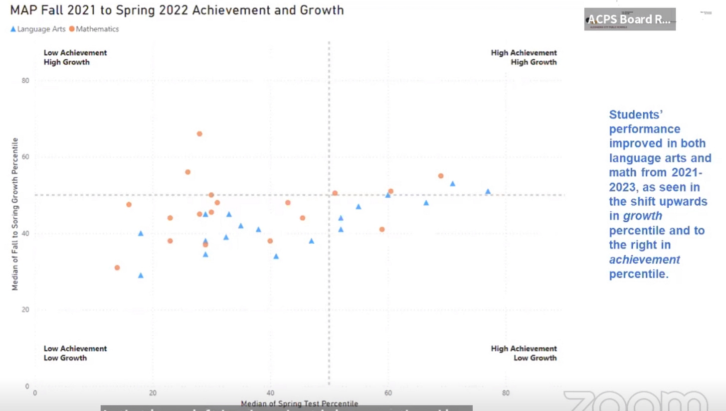
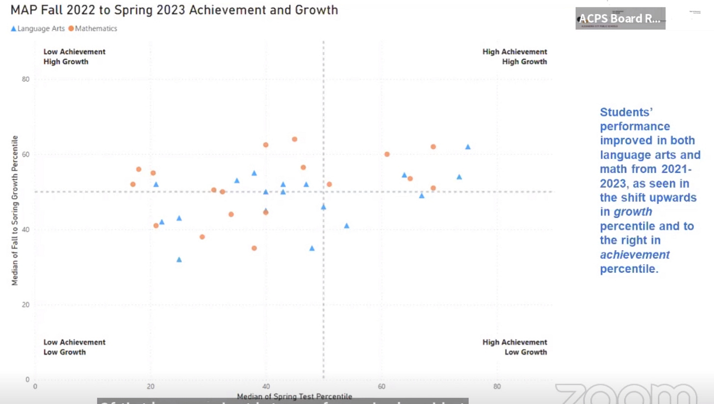
A particularly egregious example of poor “graphsmanship” is a data display that was presented to our local school board claiming to indicate some sort of “educational progress” among schools district-wide. This is how the presenter described the two charts shown below (transcript starting at the 8-minute and 3-second mark in this video here https://alexandriaschoolsva.new.swagit.com/videos/270092):
This graph really looks at both our overall achievement, which is if you look to the left, that’s lower achievement, as you move to the right, that’s higher achievement. And then it also looks at growth, and so as you move up, those are greater rates of growth, as you move down, those are lower rates of growth. And so where we want to see schools – each one these dots is a school average – and the orange circle is math, the blue triangle is language arts. And so where we want to see our school averages is in high growth and high achievement, ideally. But really high growth we know is the priority, because if we continue to show high growth every years we will get to high achievement. So what we’re looking at here [top graph] where we’re seeing the cluster in the 2021-2022 graph, is in that lower, left-hand quadrant. And that lower left-hand quadrant is low growth and low achievement. That is the exact quadrant we do not want to be in, and that’s where we found ourselves at the end of the 2022 school year … And so what I’m going to do is I’m going to click [to the bottom graph] and we’re going to see how all the distribution changes … And so we can see the shift up and out in general. Now certain now not everyone is out of that lower quadrant, but you see a significant movement out of that lower quadrant in terms of our schools. And just to put a number example to that, we had 76% of our schools falling below, just from a growth perspective, fell below that x-axis, in the 2022 school year. Over three-quarters of our schools were below the 50th percentile in growth, median average. In the current year that number went from 76 to 36%. So more than cutting that number in half in terms of growth. And you can also see there is a movement from the left to the right in terms of not just growth but also higher rates of median achievement within the schools for the content areas. So that is encouraging to see.
So what to make of these charts? First off, note that while the chart itself refers to the “median” of growth percentiles, the presenter refers to “school averages” and even “median average.” But the median and the average are two different things. The average is calculated by adding all the values in a set and dividing the sum by the total number of values. The median is the middle value when a data set is ordered from least to greatest. But let’s put that aside and go with the median as written on the chart itself. Next, the charts fail to identify the dots and triangles as individual schools. So the consumer has no way of knowing whether a particular school may have made progress or not. The charts are just a jumble of multiple dots and multiple triangles. But just taking the dots and triangles as a whole, how do the charts divide them up by quadrant? By my count, the first chart (from 2022) has a total of 11 shapes on the “High Achievement” side of the graph: 4 orange (math) and 7 blue (language arts). The second chart has a total of ten shapes on the “High Achievement” side of the graph: 5 orange (math) and 5 blue (language arts). So the result is a gain in one school (which school, the chart and presenter doesn’t say) for “high math achievement” -- but also a loss of two schools (again, which schools, the chart and presenter doesn’t say) in “high language arts achievement.” That doesn’t seem to tell the consumer much about progress in the school system regarding achievement overall. And coming out of the COVID-related school closures, it’s not much to brag about that “growth rates” went up generally, because growth rates were pretty much bound to go up at least somewhat once schools actually opened for in-person instruction again.
As Tufte writes:
Data graphics are data graphics because they have scales of measurement. Viewers should be told about measurements … [C]ommon errors and lies involve corrupt measurement scales: absence of labels, undefined or imprecise measurements, tendentiously chosen base-years, excessively short time-series, inflated rather than inflation-adjusted monetary units …The fundamental analytical act in statistical reasoning is to answer the question “Compared to what?” Whether we are evaluating changes over space or time, searching big data bases, adjusting and controlling for variables, designing experiments, specifying multiple regressions, or doing just about any kind of evidence-based reasoning, the essential point it to make intelligent and appropriate comparisons.
Tufte writes that “design devices and gimmicks cannot salvage failed content,” and that “[d]ocumentation allows more effective watching … Thoroughly describe the evidence. Provide a detailed title, indicate the authors and sponsors, document the data sources, show complete measurement scales, point out relevant issues.” And to repeat, Tufte’s philosophy of evidence displays is based on the premise that “evidence presentation is a moral act as well as an intellectual activity. To maintain standards of quality, relevance, and integrity for evidence, consumers of presentations should insist that presenters be held intellectually and ethically responsible for what they show and tell.” When that’s not done, data graphic consumers need to ask clarifying questions. As A.J. Donleavey said about expecting fair play in high places: “You’ll get it if enough folks are watching.”
I asked the school board several times if they could please provide the underlying data used for these charts as presented to them. After receiving no reply for months, I asked again, and again. I eventually received a reply that gave me several links to generic school information that didn’t answer my question. So I asked yet again. I then received a reply indicating the data I was requesting was not public yet. I asked when it would be made public. I’ve yet to receive any response to that question as of this writing. As Tufte writes, “For consumers, an indicator of an untrustworthy presentation bureaucracy is its denial of access to primary evidence.”
In the next essay in this series, we’ll explore various ways there can be corruption in the presentation of data, again using my local school board as an example.


Paul, This is a REALLY REALLY REALLY important topic. I remember being astonished by how abusable this all was when I was still in middle school...and it has gotten way worse. Somehow we need to get everyone to read/understand this -- we are deceived literally all the time. Thanks for taking on something that seems so obvious but that is so underreported.