In previous essays in this series we’ve focused on data presented by Phil Gramm, Robert Ekelund, and John Early in their book The Myth of American Inequality: How Government Biases Policy Debate. In this essay, we’ll explore other research on economic inequality.
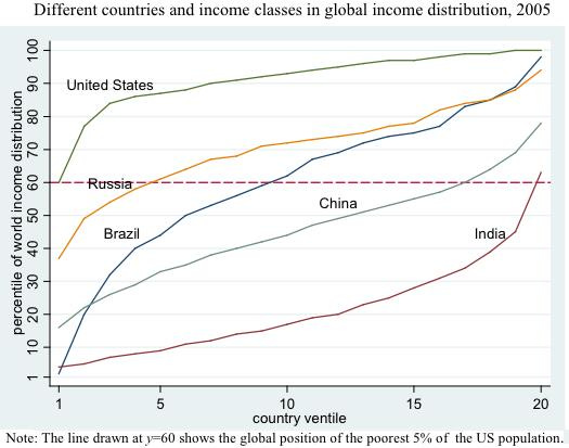
There is income inequality in America, but if one compares between countries, the poorest 5 percent of Americans are among the richest people in the world, richer than nearly 70% of all other people worldwide. The poorest 5 percent of Americans, for example, are about as rich as the richest 5 percent of Indians. In the chart below, along the horizontal axis is within-country income percentiles running from the bottom 5 percent (1st ventile) to the top 5 percent (20th ventile). Along the vertical axis are world income percentiles.
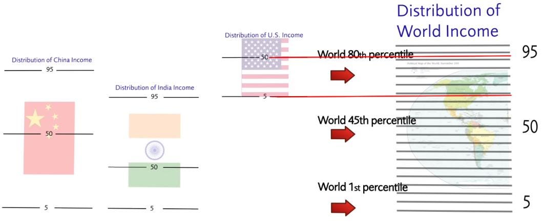
Here is another way of visualizing this data: the median U.S. household earns more than 93 percent of global households. The bottom five percent of U.S. households earn more than 68 percent of global households.
Worldwide, the world’s poorest people are getting richer faster than anyone else. And if you make more than $32,400 per year, you are among the richest 1 percent in the world.
As this graph from Our World in Data shows, virtually no one in the United States lives below the United Nations’ International Poverty Line:
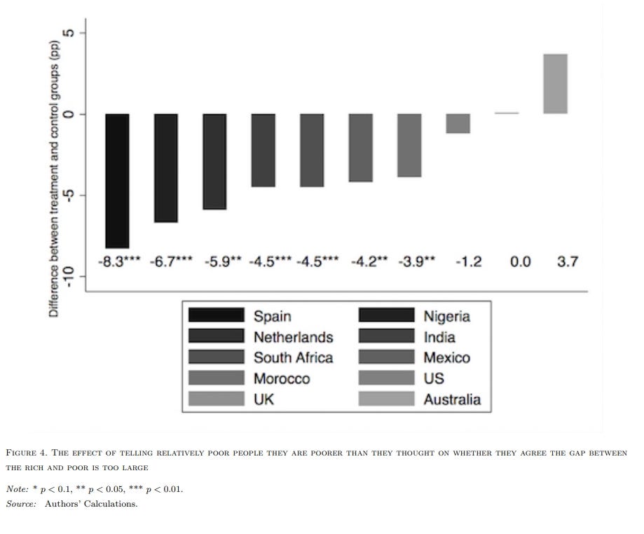
Interestingly, researchers have also found that relatively poor people around the world aren’t particularly concerned with government redistribution of income, particularly when they understand that their absolute living standards are pretty good:
We test a key assumption of conventional theories about preferences for redistribution, which is that relatively poor people should be the most in favor of redistribution. We conduct a randomized survey experiment with over 30,000 participants across 10 countries, half of whom are informed of their position in the national income distribution. Contrary to prevailing wisdom, people who are told they are relatively poorer than they thought are less concerned about inequality and are not more supportive of redistribution. Collectively these 10 countries make up around 30 per cent of the global population and represent about 40 per cent of world GDP. This is by far the largest survey experiment on how people‘s preferences for redistribution are affected by information to date and the first in multiple middle income countries. We find respondents in the poorest two quintiles of the national income distribution who are told they are relatively poorer than they thought are less concerned about the gap between the rich and poor in their country and are not any more supportive of the government closing this gap compared to respondents in the control group. This result occurs in seven countries (India, Mexico, Morocco, Netherlands, Nigeria, South Africa and Spain) and there was no effect from this information in the remaining three countries (Australia, United Kingdom and the United States) … [R]elatively poor people may be more supportive of redistribution if they believe they are set to benefit, but on the other hand they may be less supportive if they view the absolute living standard of relatively poor people as somewhat satisfactory and as such they are less likely to think redistribution to the poor is needed … Our findings are clearly counter to the hypothesis that informing people they are relatively poorer than they thought will increase their concern about the gap between the rich and poor and as a result this will increase their support for the government to reduce this gap. On the contrary, informing people they are relatively poorer than they thought lowers their concern about the gap between the rich and poor and this does not affect their preferences for redistribution.
Evidence shows that when people are asked about the ideal distribution of wealth in their country, they actually prefer unequal societies because people are not generally bothered by economic inequality itself. Rather, they naturally favor fair distributions, not equal ones, and that when fairness and equality clash, people prefer fair inequality over unfair equality.
Several researchers concluded in 2016 that based on a comprehensive analysis of benefits gotten, taxes raised, and income spent throughout life, there is much less inequality than is generally believed. They conclude: “Inequality, properly measured … is far lower than generally believed. The reason is that our fiscal system, properly measured, is highly progressive. And, via our high marginal taxes, we are providing significant incentives to Americans to work less and earn less than they might otherwise.”
As another researcher has explained:
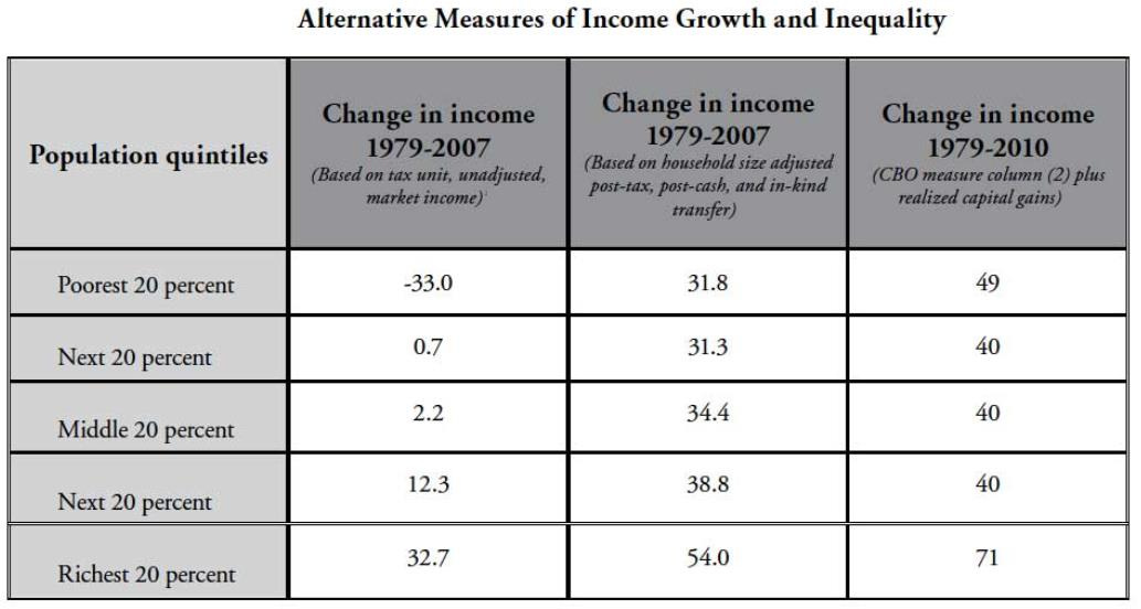
A more inclusive measure of the income that remains in households after subtracting what they must pay in taxes and adding the money they receive through government transfers transmits a different image of the American experience. Applying these criteria, instead of a decline we see a 32 percent increase in the mean income of the poorest fifth between 1979 and 2007. Overall, this broader measure still reveals a rise in inequality during that period as the mean income of those in the top bracket climbs by 54 percent. But it, too, is incomplete. Along with taxes and transfers, the most authoritative and extensive measure of income also incorporates capital gains … [T]he nonpartisan Congressional Budget Office (CBO) agrees that a comprehensive definition involves the sum of market income adjusted for taxes, household size, cash and in-kind transfers, and capital gains. However, the consensus unravels over the issue of exactly how to value capital gains. The basic choice is whether to focus on the total taxable gains realized in the year capital assets are sold or the annual change in value of capital assets whether or not they are sold. This is not just a matter of bookkeeping. The choice to include either realized or accrued capital gains in the calculation of annual income has a considerable impact on the rates of inequality. The CBO favors the use of realized capital gains that are reported on tax returns. After factoring in the impact of taxes, capital gains, and government transfers the CBO data reveal a sharp decline in inequality compared to when it is measured solely by market income. According to these figures, between 1979 and 2010 the household income in the bottom quintile increased by 49 percent, the income in the middle three quintiles increased on average by 40 percent, and those in the highest bracket increased by 71 percent. While incomes increased across the board, the largest gains registered on the two ends of the income distribution. These findings temper progressive arguments that focus on the increasing inequality of market incomes to demonstrate the need for greater social welfare spending.
Income inequality went down in the years following 2016. According to a September, 2019, report by the Census Bureau, “The official poverty rate in 2018 was 11.8%, a decrease of 0.5 percentage points from 2017. This is the fourth consecutive annual decline in the national poverty rate. In 2018, for the first time in 11 years, the official poverty rate was significantly lower than 2007, the year before the most recent recession. The number of people in poverty in 2018 was 38.1 million, 1.4 million fewer people than 2017 … Between 2017 and 2018, the real median earnings of all workers increased 3.4% to $40,247 ... The number of full-time, year-round workers increased by 2.3 million, between 2017 and 2018. The number of men and women full-time, year-round workers increased by about 700,000 and 1.6 million, respectively.”
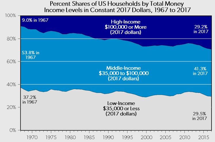
All income groups have experienced income growth since 1979.
Middle-income households in the U.S. are gradually moving up to higher income groups, not lower income groups.
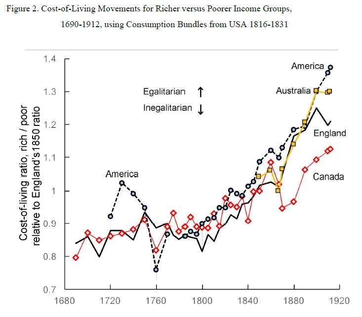
Even during the “Gilded Age,” in which industrialization spread rapidly in America and elsewhere, it appears the falling prices of necessities lessened inequality between rich and poor. Researchers have found that:
On both sides of the North Atlantic and in Australia, real inequality rose significantly less in 1800-1914 than the literature on nominal inequality has revealed. The reasons for this relate to the relative decline of food prices, rural-urban price gaps, and the delayed rise of luxury service prices, especially after 1850. Throughout these centuries, the North Americans enjoyed lower living costs than their counterparts in Western Europe … [T]he ‘nineteenth-century’ period 1815-1914 brought a clearly egalitarian for all four countries -- England, Canada, the United States, and post-1850 Australia. The net change over these hundred years is unmistakable … That is, something brought relief in the price of necessities relative to staples over those hundred years. This relative improvement for the poor did not advance evenly, however. In all four countries, there was a brief inegalitarian retreat somewhere between 1850 and 1867, though the timing of this retreat depends on which set of weights one uses. Such reversions aside, the relative costs of living in all four countries shifted unmistakably in favor of lower income groups from the end of the French Wars to the eve of the first World War.
To put income inequality in further perspective, the entire middle class in the early half of the Twentieth Century had inflation-adjusted incomes that would be under today’s poverty line, entitling them to direct benefits under today’s standards.
As Mark Perry of the American Enterprise Institute points out, when discussing differences in household income between the top and bottom households, the following should be considered:
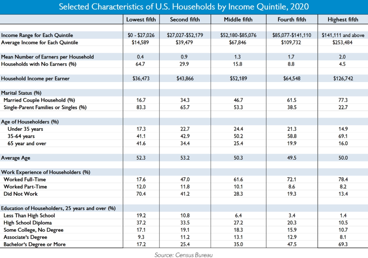
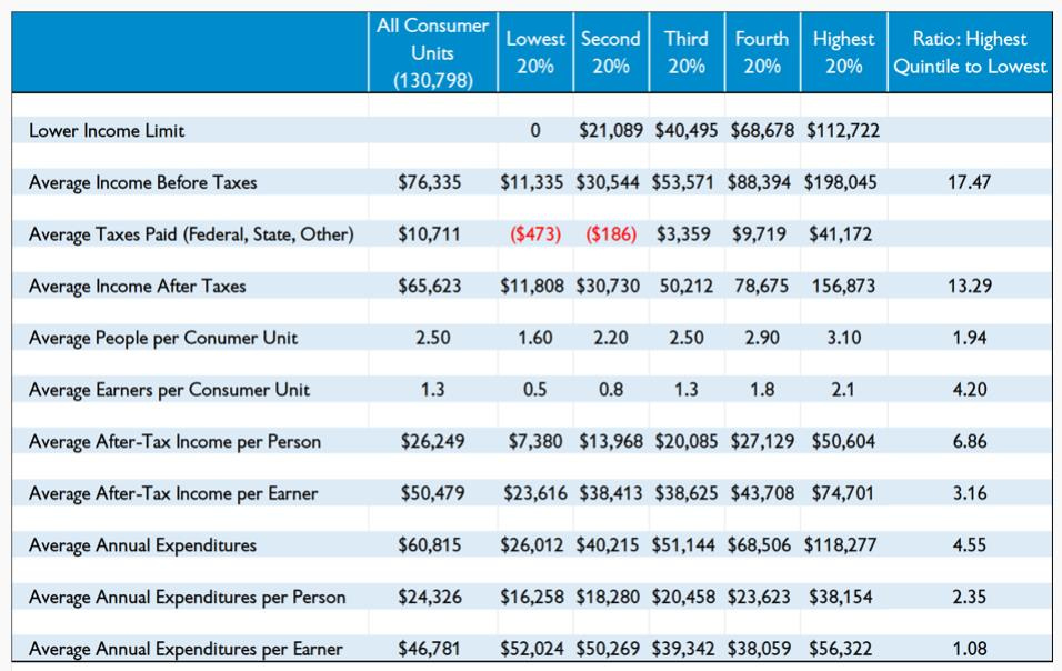
In 2014, there were roughly 125 million US households, with about 25 million households in each household quintile by income. There was an average of 2 earners per household for the top quintile versus only 0.42 earners per household in the bottom quintile (see table [below]). Therefore, we can calculate that the top income quintile included about 50 million earners while the bottom quintile represented only 10.5 million earners -- a difference representing 39.5 million more earners in the top 20% than the bottom 20%. Stated differently, there were nearly 5 earners in the top quintile for every 1 earner in the bottom quintile … [T]here would naturally be more income generated by quintiles with more earners on average (and more total earners), and the top quintile has the highest average number of earners (2.0) of the five quintiles and the bottom quintile has the lowest average number of earners (0.46), see table [below]. When looking at income shares by quintile, we would naturally expect that a much greater share of US income would be generated by the top 20% than the bottom 20% when there are nearly 5 times as many earners (and 39.5 million more earners) in the top group than then in the bottom group. That leads to another statistical outcome: Income inequality between the highest and lowest quintiles shrinks considerably when it’s calculated on a per-earner basis. For example, in 2014, there was more than a 16X difference between the average income of households in the top 20% (about $194,000) and the average income of the bottom quintile households ($11,676), see table. But that difference shrinks to only a 3.5X difference between the average income per earner in the top 20% (about $97,000) and the average income per earner in the bottom 20% ($27,800). Therefore, when measured this way, about 80% of the income inequality between the top and bottom 20% of US households that generates so much attention and hand-wringing disappears just by adjusting for the number of earners per household.
As Mark Perry reported in 2021: “Household demographics, including the average number of earners per household and the marital status, age, and education of householders are all very highly correlated with Americans’ household income. Specifically, high-income US households have more income-earners on average than lower-income households, and individuals in high-income households are far more likely on average than individuals in low-income households to be well-educated, married, working full-time, and in their prime earning years. In contrast, individuals in lower-income US households are far more likely than Americans in higher-income households to be less-educated, working part-time, either very young (under 35 years) or very old (over 65 years), and living in single-parent or single-member households.”
In July, 2019, the Bureau of Economic Analysis (BEA) published its annual revisions to personal income data, showing a large jump in disposable income and employee compensation. Employee compensation increased 42% more during the first two years of the Trump Presidency than in 2015 and 2016, much more than previously. Corporate after-tax profits increased by about $220 billion between 2016 and 2018 while employee compensation grew nearly $1 trillion. Corporate profits declined 2.9% in the first quarter of 2019 even as wages grew at an annual rate of 10.1%.
At the same time, inequality between high and low income households decreased after adjusting for taxes, household size, earners per household, and consumption.
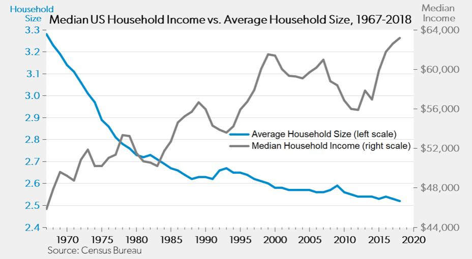
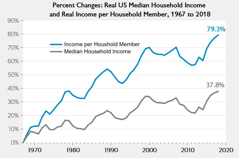
As Mark Perry points out, “Because the average size of a US household has steadily declined over time and reached an all-time low in 2018 of 2.52, the increase in real household income since 1967 of 37.8% significantly understates the increase in real income per household member of a much larger (by a factor of 2X) 79.3% over the last half-century.”
In the next essay in this series, we’ll explore additional data on economic inequality, including more common misconceptions.







Paul, This is absolutely amazing information. Why does no one seem to know any of this? Everything we are told is just to drive someone's agenda and to extort more money from the handful of people still working. I learn so much from every one of these things you pen. And here I thought I was well informed. Many thanks.