Mismeasuring Economic Inequality – Part 3
The officially misleading poverty rate, and the need for other measurement corrections.
In this essay we’ll examine how these official mismeasurements lead to misleading calculations of the poverty rate. In their book The Myth of American Inequality: How Government Biases Policy Debate, Phil Gramm, Robert Ekelund, and John Early discuss how the official mismeasurements discussed in the previous essay lead to misleading measures of the “poverty rate”:
When the War on Poverty began more than fifty years ago, the proportion of Americans living in poverty according to the official measure set by government was falling rapidly. The number of Americans living in poverty had already fallen from 32.1 percent of the nation’s population in 1947 to 14.7 percent in 1965 … After spending on the War on Poverty ramped up, the official rate of poverty, in fact, stopped improving. For more than fifty years since then, it has simply oscillated within a relatively narrow range between 11.1 percent and 15.2 percent—rising a few points during recessions and dropping similar amounts during recoveries. See the line labeled “Official percent in poverty” in Figure 3.1 for the published Census measure of poverty, with its sharp declining trend prior to the War on Poverty, followed by the stagnant oscillations from then until the present.
In 2017, the Census failed to count nearly $500 billion of government transfers received by families that Census counted as poor. Had those missing transfer payments been counted, the actual incomes for many of these families would have been well above the poverty thresholds … When the Census Bureau applied the poverty thresholds to its income measure, the result was the official 2017 poverty rate of 12.3 percent. When the poverty rate is recalculated using official government data that incorporate a full accounting of all transfer payments as income,4 the percentage of Americans living in poverty drops sharply to only 2.5 percent. The line labeled “Missing transfers added” in Figure 3.1 shows that when the transfer payments excluded by the Census are counted, the poverty rate has been in a fairly steady decline for the entire postwar period and has almost disappeared … Children and seniors within the ranks of poor families are frequently a focus of special concerns in the debates over poverty. Correcting the measure of income to include all transfer payments improves the pictures for these two groups significantly. The percentage of children living in poverty drops from 17.5 percent to only 3.1 percent. For people age sixty-five and over, the proportion in poverty falls from 9.2 percent to only 1.1 percent. Social Security, Medicare, Supplemental Security Income, food stamps, and other transfer payments have virtually eliminated poverty among seniors.
As the authors summarize:
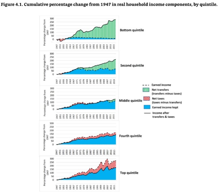
National Income and Product Accounts data from the Bureau of Economic Analysis show that from 1947 to 2017, total real transfer payments grew 211.9 percent faster than total real earned personal income. This huge divergence in the trend between transfers and earnings caused inequality of income after transfers to become significantly smaller over the last seventy years because a large share of transfer payments went to low-income households … Figure 4.1 shows in more detail how this more complete accounting affected the trends in earnings, transfers, and taxes for each income quintile over the last seventy years. For simplicity, transfers are shown as net transfers (transfers minus taxes) when transfer payments received are greater than taxes paid. That is generally the case for most of the postwar period in the bottom two quintiles shown in Figure 4.1, except in the immediate postwar years. The difference is shown as net taxes when taxes paid exceed transfers received. That is the case for the top two quintiles shown in Figure 4.1. For the middle quintile, tax increases were slightly greater than transfer increases for most of the seventy years, but since 2009 transfer payments have grown more … Figure 4.1 shows that the bottom quintile, with its substantial expansion in transfer payments and reduced tax burden, experienced faster real-income growth than any other quintile, 285 percent over the seventy years. Its faster growth did not begin until the War on Poverty programs started, however. Before the War on Poverty, although earned income in the bottom quintile grew faster than in the other quintiles, its income after transfer payments and taxes grew about the same as the others because overall transfer payments were growing more slowly than earnings and because payroll taxes on the bottom quintile more than quadrupled. The second quintile had the second strongest growth in real income after transfers and taxes. Its income rose 217 percent, with significant contributions from increased transfer payments and reduced taxes, both of which were more modest than those for the bottom quintile. Rising taxes reduced the top quintile’s net income growth to only 174 percent after transfers and taxes, somewhat ahead of the 146 percent growth for the middle quintile and 137 percent growth for the fourth quintile.
The more accurate measures show that only 1.3 percent of children and less than 0.4 percent of seniors live in poverty. For children living with married relatives, the poverty rate is a mere 0.2 percent. Poverty affects 1.7 percent of Blacks, about 92 percent fewer than shown by the Census counts.
Once one realizes the government’s mismeasurement of economic inequality, one realizes that many other measurements that piggyback of the government’s mismeasurement also require correction. As the authors note:
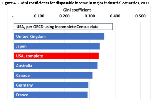
America is the world’s most prosperous large country, but critics often attempt to tarnish that achievement by claiming income is distributed less equally in the United States than in other developed countries. These critics point to data from the Organisation for Economic Co-operation and Development (OECD), which ranks the United States as having the highest level of income inequality among the seven largest developed countries. But the OECD income-distribution comparison is based on data submitted to OECD by the Census Bureau, which counts only about one-quarter of actual transfer payments, less than it counts for its published official estimates of income.15 Unlike that used for Census publications, the OECD method does account for taxes. When the OECD data are adjusted to account for all government transfer programs, income distribution in the United States aligns closely with that in other developed countries. Figure 4.3 shows the Gini coefficients published by the OECD for the seven largest developed countries, along with a second “complete” Gini measure for the United States, which includes all transfer payments. The Gini coefficients for these seven countries published by the OECD range from .291 for France to .390 for the United States. The OECD Gini coefficients are calculated for what OECD calls adjusted disposable income, with a definition similar to the income after transfers and taxes calculated in Table 2.4. The individual country estimates are prepared by the respective national statistical agencies, generally following OECD guidelines in an effort to achieve some minimum level of comparability. The Census Bureau submits the data for the United States. Figure 4.3. Gini coefficients for disposable income in major industrial countries, 2017.
The US data submissions deviate significantly from the norm by excluding large portions of government transfers to low-income households. The Census Bureau excludes two of the three largest transfer programs—Medicare and Medicaid (including the Children’s Health Insurance Program [CHIP])—which transfer more than $1.1 trillion annually, most of it to the bottom two quintiles of American households. The US data also exclude eighty-four other federal transfer programs such as Supplemental Security Income, Special Supplemental Nutrition Program for Women, Infants, and Children, and Temporary Assistance for Needy Families. Finally, states and localities directly fund another $712 billion in redistribution programs that are not included in the Census Bureau’s submission. As a result of these exclusions, the data sent by the Census Bureau to OECD for the United States Gini coefficient in 2017 failed to include $2.1 trillion of annual transfer payments, $1.6 trillion of which went to low-income Americans.17 When the available missing data are added to the US submission to the OECD, the resulting US Gini coefficient is lowered significantly, and the United States ranks between Australia and Japan, as shown by the “USA, complete” bar in Figure 4.3. When all transfer payments are included, the United States falls well within the range of the six other large, developed nations. The “USA, complete” result is validated further by other independent international data. OECD also publishes comparisons using national income and product accounts that show the United States spends 30.0 percent of its gross domestic product (GDP) on transfer payments, more than any other country except France, which spends 31.7 percent.18 These data are consistent with the finding that the OECD calculation of income inequality has omitted transfer payments for the United States that are included in the calculations for other countries … The top 10 percent of households in the United States earn about 33.5 percent of all income, but they pay 45.1 percent of income-related taxes, including Social Security and Medicare taxes. In other words, their share of all income-related taxes is 1.35 times larger than their share of income. That is the most progressive income tax share of any OECD nation … [D]o either of these differences in Gini coefficients imply greater economic well-being among low-income French and German citizens compared with low-income Americans? A calculation from the Pew Research Center answers that question with a resounding no. It uses data from the Luxembourg Cross National Data Center, which generally omits the same transfer payments excluded from the Census submissions to the OECD. But even within the context of that less complete US data, it still shows that the greater income equality measured by the Gini coefficient is no indicator of a higher level of economic well-being. The Pew calculations define lower-income households as those with less than two-thirds of the national median income after transfers and taxes, adjusted for household size. Upper-income households are those with more than twice the median, and middle-income households are those in between.29 Using each nation’s own national median income, the study found that France and Germany had 17 and 18 percent of their populations, respectively, living below the low-income level, compared with 26 percent for the United States. That would be consistent with the lower OECD Gini coefficients for France and Germany. But if the low-income level for those two supposedly more equal nations were computed using the United States’ median income rather than their own median incomes, then 33 percent of the population in both nations would be low income. Using a consistent cross-national standard like this one tells us that the supposedly more equal countries actually have 27 percent more of their population living at what is defined as a low-income level in the United States. They may be more equal, but they are equally poorer. Household income in the United States differs in only one significant way from that in other nations: Americans at all levels have a lot more of it. American income after taxes and transfers is not distributed more unequally than income in some other large, developed economies. And compared to the other large, developed countries claiming more income equality, far fewer Americans have low incomes because the American economy creates more economic value, paying higher wages and salaries.
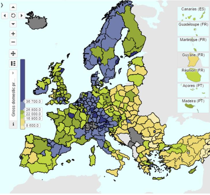
By other measures, most of Europe is a lot poorer than the United States. In the chart below, purple areas are as rich as U.S. states. Yellow areas are poorer than Mexico. The few dark areas (a handful in Germany and one each in a few other nations) are the only parts of Europe that are equal or better than the United States in economic terms.
In 2013, Thomas Piketty published his book Capital in the Twenty-First Century, which became widely cited to support efforts to reduce economic inequality. However, as the authors of The Myth of American Inequality write:
The Piketty income data do not include transfer payments … His calculations show a dramatic increase in income inequality in postwar America because he ignores the massive infusion of transfer payments to the low end of the income distribution and imputes income that was never received to the high-end households. If he had included transfer payments as income to the recipients and counted only income that high-income taxpayers actually received after taxes, his empirical evidence of growing income inequality in postwar America would have collapsed. As already shown in Chapter 4, when all transfer payments are counted as income to the recipients and income is measured conventionally in terms of payments actually received and retained after taxes, income inequality is lower today than it was in 1947 … [H]igh-income Americans already bear a significantly greater relative share of the income-related tax burden than their peers in other developed nations. The bottom 90 percent in America pay proportionately less than in other developed nations, even before counting the regressive value-added taxes that many other nations also pay. Although the Organisation for Economic Co-operation and Development has not updated these international comparisons since 2015, the Congressional Budget Office evaluated the effects of the 2017 tax cuts and found that they made the American income taxes even more progressive, with higher-income households paying proportionately still more of the total tax burden.
In the next essay in this series, we’ll examine the failure to reasonably measure the influence of technology on well-being.


Paul, So once again, we learn that EVERYTHING we hear from the government is a lie or a deception -- usually both. Is this really all just hopeless? Is there room for even one truth teller out there? (Besides those outside the system like you...)