Mismeasuring Economic Inequality – Part 2
What official measures leave out: what higher-income people lose through taxes.
As described in the previous essay, in their book The Myth of American Inequality: How Government Biases Policy Debate, Phil Gramm, Robert Ekelund, and John Early describe how official government statistics used to calculate economic inequality in America fail to account for most government benefits people in lower-income categories receive. Next, the authors of The Myth of American Inequality examine another distortion in measurement at the other end of the inequality comparison, namely the way in which incomes are calculated for those at the higher end of the income spectrum:
Table 2.3 shows the average tax payments to federal, state, and local governments by household in each income quintile. The top quintile on average paid $80,828 of federal taxes, more than eighty-three times as much as the bottom quintile. The federal personal income tax was the largest tax payment, with top-quintile households paying an average of $54,006, while the bottom two quintiles paid no federal income tax at all, in part because the Earned Income Tax Credit and the Child Tax Credit offset any income taxes that they would have otherwise owed. These credits are “refundable,” which means that if the credit is larger than the taxes that would have been paid without the credit, the IRS sends a check for the extra unused credit. These cash payments for unused credits are counted as “other federal transfer payments” in Table 2.2. The middle quintile paid about 4 percent of all federal income taxes, the fourth quintile paid 13 percent, and the top quintile paid fully 83 percent of the total income tax bill … The top quintile paid 8.6 times as much in state and local taxes as the bottom quintile, compared with 83.4 times as much in federal taxes. The major source for this difference is the federal personal income tax. It is much more “progressive” than state and local income taxes—that is, higher-income households pay proportionately much more than lower-income households.
Table 2.4 brings together earned income, government and private transfers, and taxes to calculate the total income after taxes for the average household in each income quintile. The average bottom-quintile household earned only $4,908 but received $45,389 in government transfers and $3,313 from private transfers, bringing its total income to $53,610. It paid $3,996 in payroll, excise, sales, property, and other taxes, which reduced its after-tax income to $49,613. Second-quintile households earned on average $30,931 annually, more than six times as much as those in the bottom quintile. About 80 percent of these higher earnings came from a larger proportion of prime work-aged persons being employed and working more hours. Second-quintile households received about one-third less in government and private transfers, resulting in $62,765 of income before taxes. Although their income before taxes was $9,155 higher than the average for the bottom-quintile household, they paid more than half of that difference in higher taxes because a greater portion of their income was earned and, hence, subject to payroll and income taxes. As a result, the average second-quintile household had only 9 percent more income after taxes than the bottom quintile had. The average middle-income household earned $66,148. The taxes it paid and the transfers it received almost exactly offset each other. The fourth quintile earned $112,563. Government and private transfers, primarily from Social Security and Medicare, added $10,603. Taxes took away $35,034, or 28 percent of that total income, leaving the average fourth-quintile household with only $88,132. The top-quintile households earned, on average, $295,904. These earnings came from almost-universal employment of its prime work-aged members, who mostly worked full-time, and from a significant number who worked beyond the normal retirement age or while they were full-time students. Transfers from Social Security, Medicare, and private scholarships added less than 3 percent to their before-tax income. They paid $106,997 in taxes, which accounted for 61 percent of the taxes paid by all households. That reduced their after-tax income to $197,034, only 67 percent of what they had earned. In addition to the combined effect of transfer payments and taxes on the distribution of income shown in Table 2.4, the next to the last column shows taxes as a percentage of income. The average tax rate rises steadily from 7.5 percent in the bottom quintile to 35.2 percent in the top quintile. These numbers show that at least up to the top 20 percent of income earners, the claim that high-income households pay a lower share of their income in taxes is wrong. The results of Table 2.4 are startling. The most surprising result is just how distorted the general perception of income distribution is when one takes full account of all transfer payments and taxes. While the average top-quintile household earned 60.3 times more than the average bottom-quintile household, it was left with only 4.0 times as much income after accounting for all transfer payments received and all taxes paid … The Census publications for 2017 show a ratio of the average income for the top quintile to the average for the bottom quintile as 16.7 to 1.32 That is more than four times larger than the 4.0 ratio that exists when all earnings, transfers, and taxes are counted. Figure 2.1 displays the data from Table 2.4 visually. The dashed line shows earned income. The solid bold line shows income after all transfer payments and taxes. In the lower quintiles, the area filled with vertical stripes represents net transfers (total government and private transfers minus total taxes paid). In the upper quintiles, taxes exceed transfers, and the net-taxes area with diagonal stripes shows the reduction in income from taxes paid in excess of transfer payments received. The bold solid line is the resulting income after taxes and transfers. An eye-catching result in Figure 2.1 is that the bottom quintile’s average net income after transfers and taxes is $49,613, clearly within the range of what is generally considered the earned income of middle-income America, $46,656 to $87,171 … Government takes and redistributes enough resources to elevate the average bottom-quintile household into the American middle class. Also note the stunning fact that the second quintile of households has an average net income after transfers and taxes that is only 8.6 percent above the average income of the bottom quintile. This means the second quintile is only slightly better off than the bottom quintile despite the fact that the second quintile earned more than six times as much, it had more than twice the proportion of its prime work-aged adults working, and they worked, on average, 1.8 times as many hours per week.
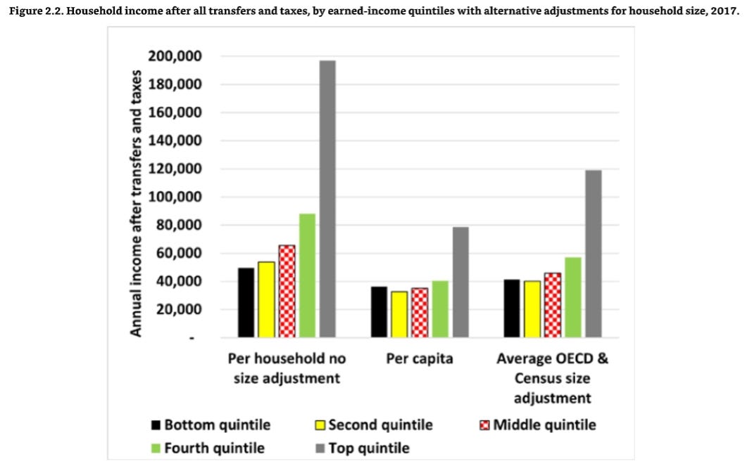
Figure 2.2 shows the effects of three different approaches to adjusting for household size applied to the more complete income measure counting all transfer payments received as income and all taxes paid as income lost. The first one, per household, makes no adjustment for household size. The most direct method to adjust for household size is to divide total household income by the number of people in the household to get a per capita measure of the amount of income available. On that basis, the average bottom-quintile household receives $36,079 per capita. The higher quintile households have on average $32,477, $35,142, $40,549, and $78,837 per capita, respectively. On a per capita basis the top quintile has only 2.2 times as much income per person living in the household as the bottom quintile, a considerably smaller difference than the 4.0 times as much without any adjustment for household size. But the blockbuster finding is that on a per capita basis the average bottom-quintile household receives over 10 percent more than the average second-quintile household and even 3 percent more than the average middle-income household!
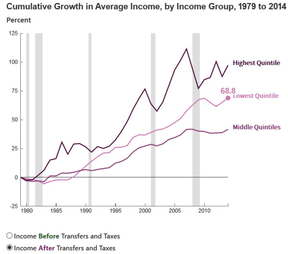
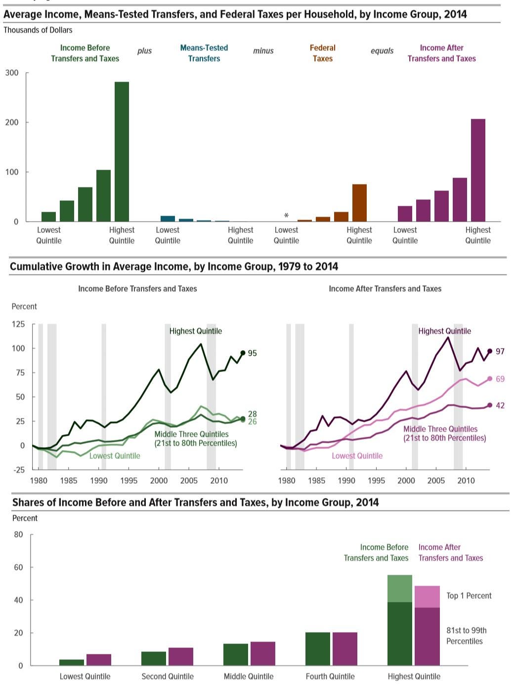
According to the Congressional Budget Office, over the last several decades, income is up for all quintiles and, after taxes and transfers, those in the lowest income quintile have done quite well in terms of their cumulative growth in average income.
As described by the Congressional Budget Office, more than half of Americans receive more money in various types of government transfer payments (Medicare, Medicaid, food stamps, Social Security) than they pay in federal taxes.
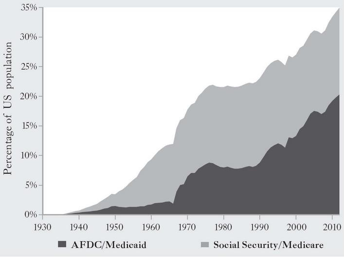
Regarding Social Security and Medicare, from 1935 to 2012, the proportion of Americans receiving those benefits from the federal government went from zero to 35 percent.
Between 1983 and 2011, the percentage of Americans participating in entitlement programs jumped by nearly 20 percentage points. This is not the result of an aging population, because over the period in question the percentage of Americans in homes receiving Social Security payments increased by only a little over two percentage points, and by just over three percentage points for those in households receiving Medicare. So less than one-sixth of that 20-point jump can be attributed to increased reliance on “old age” programs.
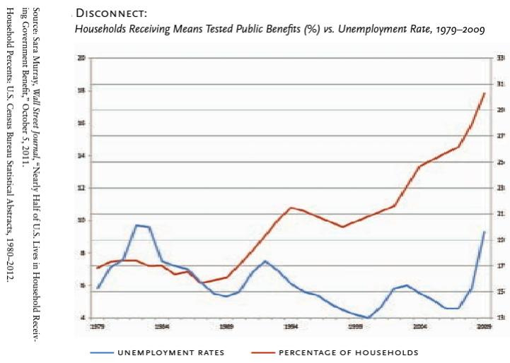
At the same time, American households today are generally receiving means-tested public benefits at a rate significantly higher than the unemployment rate.
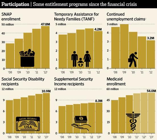
For example, food stamp (SNAP program) participation is generally cyclical, rising during recessions and falling during recoveries. But that has not been happening recently, as the following chart shows.
That trend has occurred among many different entitlement programs: government benefit recipience is up while unemployment claims are down.
And as Matt Weidinger has explained:
Americans are not moving away from the places where jobs have disappeared to where work is plentiful. Today, Americans are moving at the lowest rate in 70 years. Historically, Americans have always been willing to move to boost their earnings, especially compared to foreign peers. So why the declining mobility today? Among the key reasons are the increasing share of two-earner households (it’s harder to find two new jobs rather than one) and higher housing costs. And, in a classic case of unintended consequences, the lure of existing government benefits also may encourage Americans to stay put despite poor job prospects. Researchers in a 2014 National Affairs article noted that “low-income people, especially those born into poverty, have a particularly difficult time moving. This is largely due to…programs that aim to help the poor where they already live.” After struggling to get access to complex safety net benefits, why risk moving and starting the process all over again if a new job doesn’t work out?
The sorts of measurement biases we examine here confuse politicians as well. As the authors of The Myth of American Inequality write:
Ironically, President Joe Biden, House Speaker Nancy Pelosi, and Senate Majority Leader Chuck Schumer all proclaimed in the fall of 2021 that their proposed monthly child tax credit costing $1.6 trillion over a decade would “cut child poverty in half.” They were, by definition, absolutely wrong. The official poverty rate does not count the refundable portion of tax credits as income, even though the benefits are paid with a check from the Treasury. And the same mismeasurement problem also invalidated their original claim that the transfer payments were needed in the first place owing to high childhood poverty. That claim was invalid because the official child poverty rate was five times larger than it would have been had the Census merely counted all transfer payments as income to the recipient—only 3.1 percent versus the official 17.5 percent … In the fall of 2021, those disconnects between official statistics and reality were on full display. The administration and majority leadership in Congress were calling for huge additional increases in federal transfer payments on top of an unprecedented 45 percent increase in 2020.10 The Census Bureau was preparing for the scheduled release of household income and poverty figures. After the government spending spree to boost household income, the Census Bureau leadership was confronted with a problem: the official statistics for median household income showed a 2.9 percent decline, which suggested that all that big spending didn’t help those households that received the transfer payments. Of course, that decline shown in the official statistics occurred because most of those extra transfer payments have never been counted as income by the Census Bureau. So, for the first time ever, in the same publication alongside the official numbers, the Census Bureau issued a second set of estimates that included the types of transfer payments that the government had been making all along but that Census had never counted before. By counting some of these missing transfer payments, median household income miraculously rose 4.0 percent rather than falling 2.9 percent, as the official data showed.11 The official poverty rate for 2020 increased by 1.0 percentage point. But for the first time in its primary data release, Census explicitly referenced another special research poverty rate that included some of the missing transfer payments and showed that the poverty rate declined by 2.6 percentage points. Clearly, the official data need to be fixed and not just adjusted ad hoc when the information they convey is obviously not credible.
In fact, child poverty in America (based on children’s consumption of goods and services) has steadily declined for more than 50 years, and in 2018, the child poverty rate was at an all-time low.
The sorts of measurement biases we examined earlier also infect media analyses of the tax records of high-income earners. As the authors of The Myth of American Inequality write:
In June 2021, ProPublica posted what it claimed were tax returns of the twenty-five richest filers stolen from the IRS. It used the revelation of stolen returns to claim that the wealthiest twenty-five people only paid 3.4 percent of their incomes in income taxes in recent years. That claim was contrary to the actual stolen tax returns themselves and is inconsistent with the publicly available IRS data showing that the top four hundred income earners paid on average 32 percent of their income in federal income and payroll taxes. The difference arose because ProPublica engaged in a classic bait and switch. It claimed to be presenting stolen information from the IRS, but while the taxes paid may have come from the stolen documents, the income figures used to calculate the 3.4 percent were pure fiction. In addition to the actual taxable income reported on the documents, ProPublica included a guess about how much the value of assets held by these individuals might have appreciated. No one pays taxes on the appreciation of their assets such as homes, pension funds, or any other investments until they are sold and, in the process, generate income.
The authors then turn to the topic of the “Super Rich,” and show how their status at the highest echelons of the income spectrum is generally fleeting:
[Regarding] the “super rich,” … there is no obvious definition for the term. In the 96th to the 99th percentiles, just below the top 1.0 percent, households earned almost 90 percent of their income from the wages and salaries they earned working. They earned an average of almost $355,000 per year and, on average, kept less than $225,000 after taxes. Certainly, they were well off, though hardly super rich. In fact, the first households earning $1 million do not appear until percentile 99.3. These so-called millionaire earners, however, lost about 40 percent of their income to taxes, and 57 percent of them dropped below the millionaire-earner status after taxes. One could safely apply the term “super rich” to the 127,600 households in the top 0.1 percent of household earnings. On average, they earned about $7,527,000, and although they lost about 40 percent to taxes, they still averaged more than $4,526,000 in after-tax income … For those who earn very high incomes, their stay in the exclusive income groups can be short. A study of publicly available IRS data between 1992 and 2014 showed that 4,584 different households were in the top four hundred at some point over the twenty-three years. Nearly three-quarters qualified for only a single year. The average length of time a tax unit was in the top four hundred was only 2.01 years. On average, in any given year, only one-third of the four hundred had been in the group for ten or more years … Each of the top four hundred households is almost a special case given the large amounts of income from onetime asset sales. To put the economic significance of this tiny group of super-rich households in perspective, if government seized all of their after-tax income, it would fund the federal government for less than six days.
Indeed, a 2019 study by four economists, “Capitalists in the Twenty-First Century,” analyzed anonymized data of all American taxpayers to determine who dominated the top 0.1 percent of earners and reports on the more than 140,000 Americans who earn more than $1.58 million per year. The researchers found that the typical rich American is not who most might think they are, but rather, in the researchers’ words, the owners of a “regional business,” such as an “auto dealer” or a “beverage distributor.”
In the next essay in this series, we’ll examine how these official mismeasurements lead to misleading calculations of the poverty rate.





Powerful explanations that deserve much higher visibility in GOP's talking points. Maybe we could require an exam for all candidates seeking public office or jobs in journalism.